
Text blocks, pages, tags & attendance
Text blocks, your own pages and theme blocks for the course website, reasons for absence and leaving, tags and attendance entries. These texts sit right next to the fields inside Kursimple – here they are to read through.
Text blocks
Text blocks
Fixed texts that are output at certain places in the booking portal or in documents – e.g. a note in the shopping cart or a footer – per language. Create a new text via “Create new text block”; position and language determine where it appears.
A text block is bound to a position (a technical name for the place in the portal). Which positions your theme knows you learn from support or from the theme documentation. There should be only one block per position and language.
Changes take effect immediately in the portal – check the place after saving.
Position
The place where the text is output (technical name, e.g. for shopping cart or footer).
The positions are defined by your portal's theme.
Subject
The heading or internal designation of the block – depending on the position it is output as well.
Change via the pencil.
Message
The actual text, shortened. In full in editing.
You see the formatting in the portal.
Language
For which language of the portal the block applies (e.g. de, en).
For a multilingual portal create one block per language.
Actions
Pencil = edit. Bin = delete – the text disappears from the portal immediately.
Before deleting, check whether the place in the portal may then stay empty.
Create new text block
Creates a text for a position: fill in position, language, subject and message, save.
If a block already exists for the position, it is better to edit that one.
Edit text block
Edit text block
Position, language, subject and message of a text block. Changes take effect immediately in the portal.
After saving, look at the place concerned in the portal.
Position
The technical name of the place in the portal where the text appears. Spelling exactly as specified by the theme.
If unsure, take an existing block as a template.
Language
Language code of the text, e.g. “de”. Create a separate block for each portal language.
The portal chooses the block that matches the visitor's language.
Subject
Required field: heading or internal designation of the block.
Visible or internal only, depending on the position.
Message
The text itself, with formatting via the editor (paragraphs, bold, links).
Short and understandable for customers.
save
Applies the text block – takes effect immediately in the portal.
Afterwards back to the list.
cancel
Back to the list without saving.
Entries are lost.
Create new page
Create new page
Creates a portal page: title, slug (URL), parent page, top/footer navigation, menu item without page, content, active.
New pages are appended at the end of their level; you change the position afterwards by drag & drop in the list.
Order and level by drag & drop
Grab a page by the handle (⋮⋮) and drag: up or down changes the order, into the indented list below another page makes it a subpage. It is saved immediately, the status message on the right confirms it.
Subpages move along when you drag. Nesting can be of any depth; in the portal navigation subpages appear as a submenu.
Title
The page title – heading in the portal, browser title and text of the menu item. Indented entries are subpages of the page above; a folder icon marks menu items without their own page.
A click opens “Edit”.
Address
The path of the page: “directions” gives /page/directions. A click opens the page in the portal in a new tab. Menu items without a page have no address.
Lowercase letters, digits and hyphens only.
Navigation
“Top” = the page is in the main menu at the top, “Footer” = in the footer area. Both are possible; without a marker the page is reachable only via its link.
Set via “Edit”. Pure menu items without a page group their subpages there.
Content
“Builder” = the content was designed with the page builder. Otherwise the region name is shown here whose theme blocks make up the content.
Region pages: no blocks with this name = empty page.
Status
Only active pages are reachable in the portal and appear in the navigation; inactive ones return an error page.
Leave inactive for preparing.
Actions
Edit = settings and content of the page. Delete = remove the page after confirmation; its subpages move up one level.
Theme blocks are kept when deleting.
Edit page
Edit page
Title, URL, placement in the page tree, navigation and visibility of a portal page – and below it the content: designed with the page builder or from theme blocks of a region.
After saving, check the page via the link in the list. A pure menu item without a page has no content.
Page title
Required field. Heading of the page and text of the menu item, e.g. “Directions”.
Keep it short – the menu item has little space.
URL (slug)
The path in the portal, e.g. “directions” → /page/directions. Lowercase letters, digits and hyphens only; must be unique. After publication preferably do not change it any more (old links).
No spaces, no umlauts.
Active?
Ticked = page reachable in the portal. Without the tick for preparing.
Inactive pages return an error page.
Header image
Picture across the full width between the header and the content of the page.
Click “Choose image”, crop the picture and save the page. A wide picture fits well, e.g. 1920 × 500 px.
In the portal the picture appears above the page content; with some designs (e.g. Kunstschule Koppelschleuse) directly below the navigation. With “remove” and saving it disappears again.
Content
The content of the page. In the builder you drag blocks onto the canvas: “Content” offers ready-designed sections (hero, text with picture, columns, tiles, quote, list, table, question & answer, note), “Pictures & videos” picture with caption, gallery, banner, carousel, team and video, “Kursimple” address, contact, legal notice, locations, directions map and buttons into the course offering – pre-filled with your provider data. On the right you set styles and settings of the selected element.
The canvas shows the page with your portal's design. At the top: layout templates (first icon – whole pages such as “Home page”, “About us”, “Directions”, “Contact”, “Picture gallery”, “Team”, “Event”, “Testimonials”, “Frequently asked questions”, “Terms” or “Legal notice” as a start; loading replaces the current content), preview, full screen, show HTML, import HTML, undo. Under “Basic elements” you find empty columns, text, picture, video and map for free design.
Pictures: a double-click on a picture opens the image manager. On upload each picture first passes through the image editor – crop, aspect ratio (e.g. 16:9 for banners, 1:1 for team photos), rotate, target size; “Cancel” uploads the original. Uploaded pictures are then available for all pages and emails. For the carousel you select the carousel or a slide and switch the visible slide with the arrows in its toolbar – this is how you reach picture and text of the second and third slide; in the portal the first slide always starts, then it continues automatically. Videos: insert the block, then on the right under “Settings” enter provider (YouTube/Vimeo) and video ID – the ID is in the video address after “v=” or at the end.
The Kursimple blocks take address, phone, email and web from the tenant administration and the locations from “Locations” – changes there do not automatically land in blocks already inserted. Legal texts such as terms and legal notice are only frameworks: insert content and have it checked. It is only saved with “Save” at the bottom.
Builder or theme blocks
Switch for how the content is maintained. Builder = blocks by drag & drop (recommended). Theme blocks = the content comes from blocks with a region name (previous way).
When switching a theme-block page to the builder, the previous content is taken over as the starting content; the theme blocks are kept. Switching reloads the page – save unsaved entries beforehand.
Region name
Only in “Theme blocks” mode: freely selectable name, e.g. “page_anfahrt_content”. You enter exactly this name at the theme blocks as “Region” – the blocks are then the content of the page.
Spelling exactly the same (upper/lower case).
Parent page
Empty = main menu item. If you choose a page, this page appears as a sub-item below it – also multi-level, e.g. “About us” → “Team” → “Management”.
The page itself and its own subpages are not available for selection, otherwise a loop would arise.
Position
Order within the level – the lower, the further forward. New pages are automatically appended at the end.
In the overview the order can also be changed by drag & drop.
Show in the top navigation?
Ticked = the page appears in the main menu at the top of the portal. Without the tick it is reachable only via its link (e.g. from an email).
Subpages appear as a submenu of their parent page.
Show in the footer navigation?
Ticked = the page appears in the link list in the footer area of the portal, e.g. for legal notice, privacy or directions.
Top and footer can be combined.
Menu item only, without its own page
Ticked = the entry is only a heading in the menu that groups its subpages. It has no content of its own and cannot be opened.
Example: “About us” as a menu item with the subpages “Team” and “History”.
Save
Creates the page or applies changes – takes effect immediately in the portal.
Afterwards maintain content via theme blocks.
Theme blocks (page builder)
Theme blocks (page builder)
Content blocks for your portal: each block belongs to a theme and a region (a place in the layout, e.g. logo area, or the region of a custom page). This is how you design home page and content pages without programming.
Procedure: “Create new block” → choose theme (the active one is in the variable THEME_NAME) → enter region → type (HTML/text, plain text, image URL) → content → sorting → save → check the portal.
Which regions a theme knows is in its documentation or with support. Within a region the sorting determines the order.
Create new block
Creates a content block: theme, region, type, content, sorting.
Write the region exactly as the theme or the dynamic page expects it.
Theme
The theme in which the block is output. Only blocks of the active theme (variable THEME_NAME) are visible in the portal.
When changing theme, create blocks for the new theme.
Region
The place in the layout (e.g. “header_logo_area”) or the region name of a dynamic page.
Spelling must be exact.
Sort.
Order within the region – smaller numbers first.
Change via “Edit”.
Type
HTML/text (formatted content from the editor), plain text or image URL – determines how the content is displayed.
For pictures enter the type image URL and the address of the picture.
Content (preview)
Shortened preview of the content; for pictures a thumbnail. In full in editing.
The portal shows the finished block.
Actions
Edit = content and settings. Delete = remove the block after confirmation – takes effect immediately in the portal.
Check beforehand whether the place in the portal may stay empty.
Edit theme block
Edit theme block
Theme, region, sorting, type and content of a block. Changes are visible in the portal immediately – after saving, open the page in the portal.
Region and theme determine where the block appears; type and content what is seen.
Theme name
The theme the block applies to. Choose the active theme of your portal (variable THEME_NAME), otherwise the block stays invisible.
From the list of installed themes.
Region (position)
Technical name of the place in the layout, e.g. “header_logo_area” – or the region name of a dynamic page. Spelling exact.
Existing blocks show valid region names.
Sorting
Order within the region – lower numbers appear first.
10, 20, 30 leaves room for insertions.
Type
HTML / text (editor) for formatted content with pictures and links, plain text for unformatted lines, image URL for a single picture.
With image URL the content contains only the address of the picture.
Content
The text or HTML of the block. For the type HTML format via the editor and insert pictures via the image library.
Check in the portal after saving.
Save
Applies the block – takes effect immediately in the portal.
Afterwards back to the list.
Absence reasons
Absence reasons
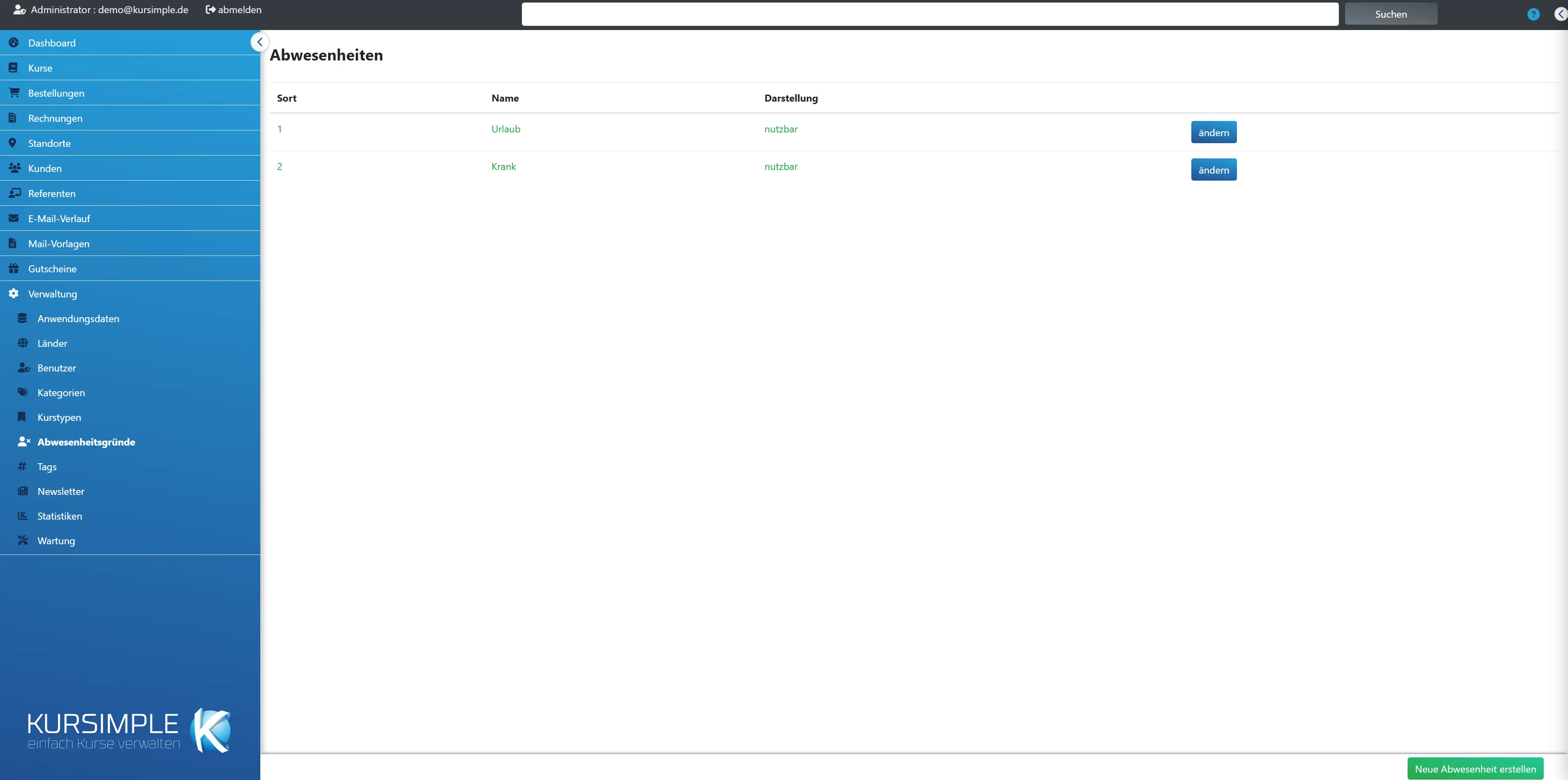
The reasons that speakers and administration can choose when recording attendance in the course – e.g. “sick”, “excused”, “unexcused”. They appear in the selection of the attendance list and in exports.
Create few, clear reasons. A reason that is already used in attendance cannot be deleted – instead remove the tick “Active”, then it is no longer offered and old entries remain legible. You see and maintain only the reasons of your own provider. The menu item appears only if attendance management is switched on (variable PRESENCE).
Sort
Order in the selection list – smaller numbers first. Put the most common reason at the top.
Change via “change”.
Name
The designation of the reason as it appears in the attendance list.
Keep it short.
Display
Whether the reason is active, i.e. selectable. Inactive reasons are kept in old entries.
Toggle via “change”.
Attendance
In how many recorded attendance entries the reason is entered. From one entry on it can no longer be deleted, only hidden.
To hide: open “change” and remove the tick “Active”. The recorded attendance entries keep their reason.
Actions
“change” opens name, sorting and active status.
Changes take effect immediately in the attendance list.
Create new absence
Creates a reason: name, sorting, active.
Afterwards it is available in the selection of the attendance list.
Edit absence reason
Edit absence reason
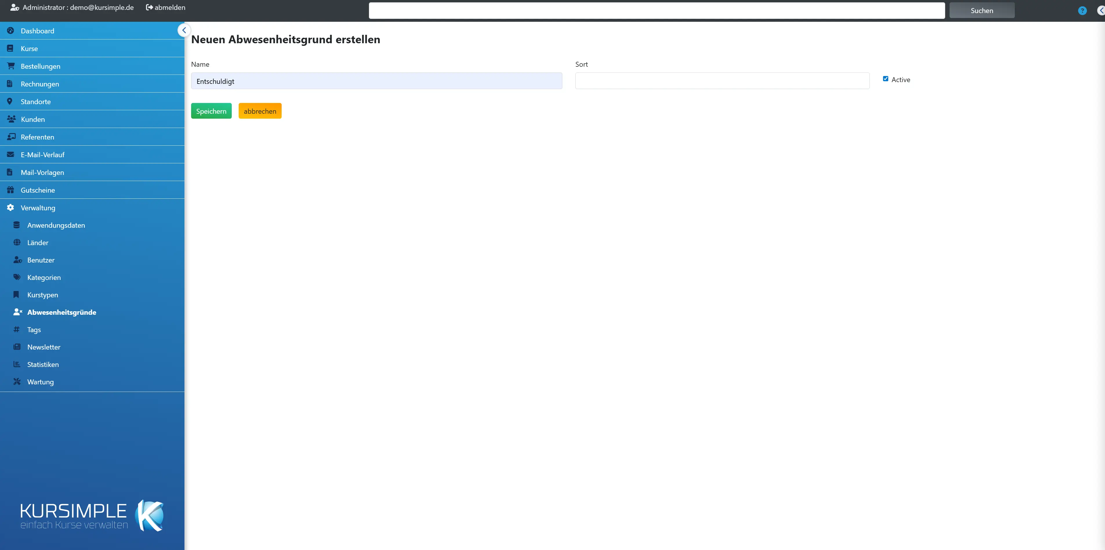
Name, sorting and active status of a reason. Changes take effect immediately on the selection in the attendance list.
Old entries keep the reason even after renaming. “delete” exists only as long as the reason is in no attendance entry – otherwise the button is grey and you hide the reason via the tick “Active”.
Name
Required field. Short, unambiguous designation, e.g. “sick”.
Appears in the attendance list and in exports.
Sorting
Order in the selection – smaller numbers first.
Common reasons to the top.
Active
Ticked = reason is selectable. Without the tick it stays in old entries but is no longer offered – this is how you take an already used reason out of the selection.
Toggling is possible at any time.
Save
Applies the reason – takes effect immediately.
Afterwards back to the list.
cancel
Back to the list without saving.
Entries are lost.
Terms (tags) for customer segmentation
Terms (tags) for customer segmentation
Coloured markers that you assign to customers, participants and speakers – e.g. “Member 2027”, “Corporate customer”, “Interest yoga”. You filter the customer list by tags and choose recipients for bulk emails.
Procedure: create the tag here (title, description, colour) → assign it in the customer record in the “Tag” tab → filter by the tag at the top of the customer list → “Email to all customers” then writes only to this group.
The feature appears only if the variable TAGS is switched on. Choose few, easily distinguishable colours.
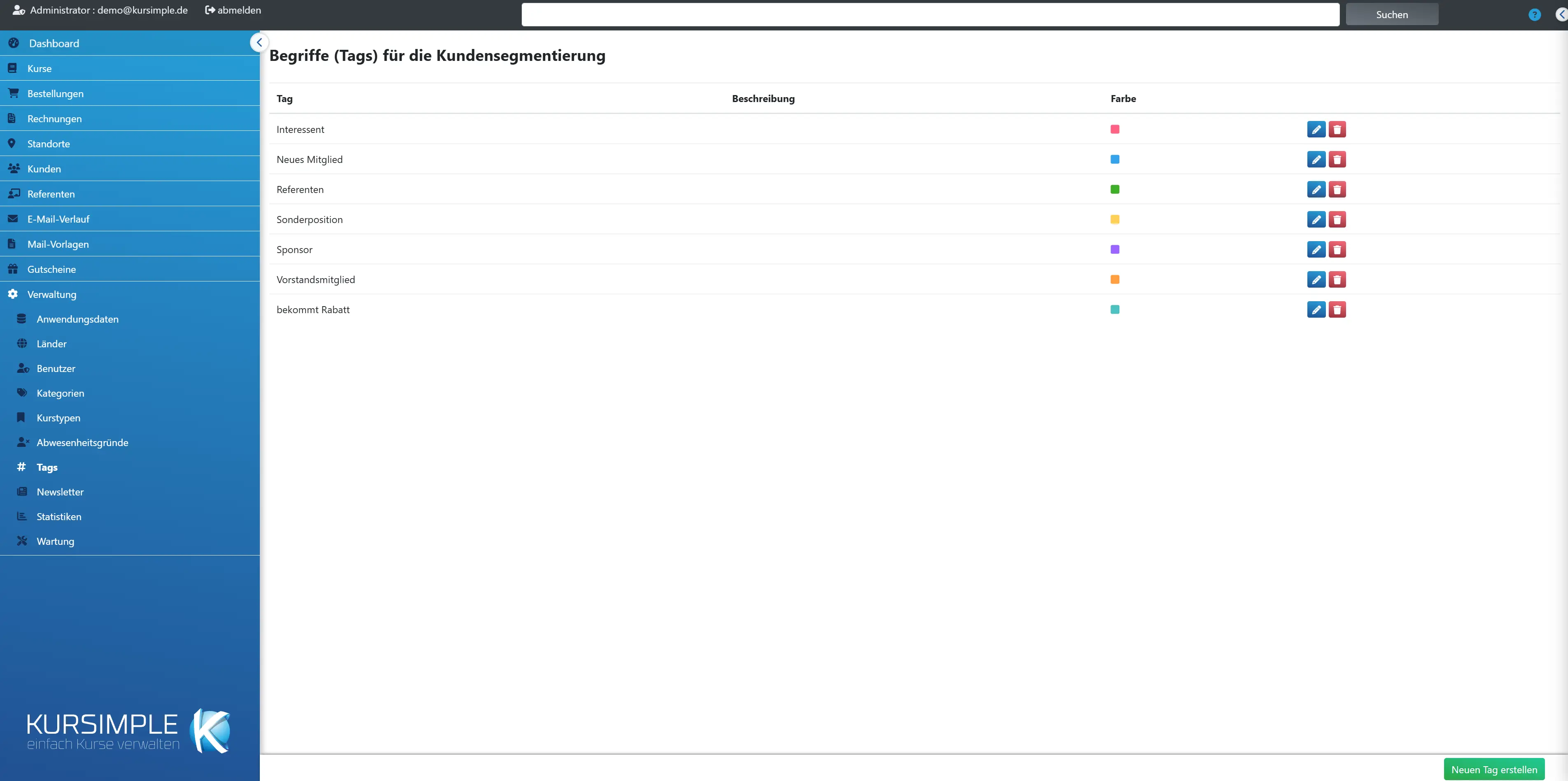
Tag
The designation of the tag – appears as a tooltip on the colour square in the lists.
Change via the pencil.
Description
What the tag is meant for – so that colleagues use it correctly.
E.g. “Customers with valid club membership”.
Colour
The colour of the square in customer, participant and speaker lists.
Choose easily distinguishable colours.
Actions
Pencil = edit. Bin = delete – the assignments for all persons are removed in the process.
Before deleting, check whether the tag is still needed for filters.
Create new tag
Creates a tag: title, description, colour. Afterwards assign it in the customer record.
Short titles so that the tooltip stays legible.
Edit tag
Edit tag
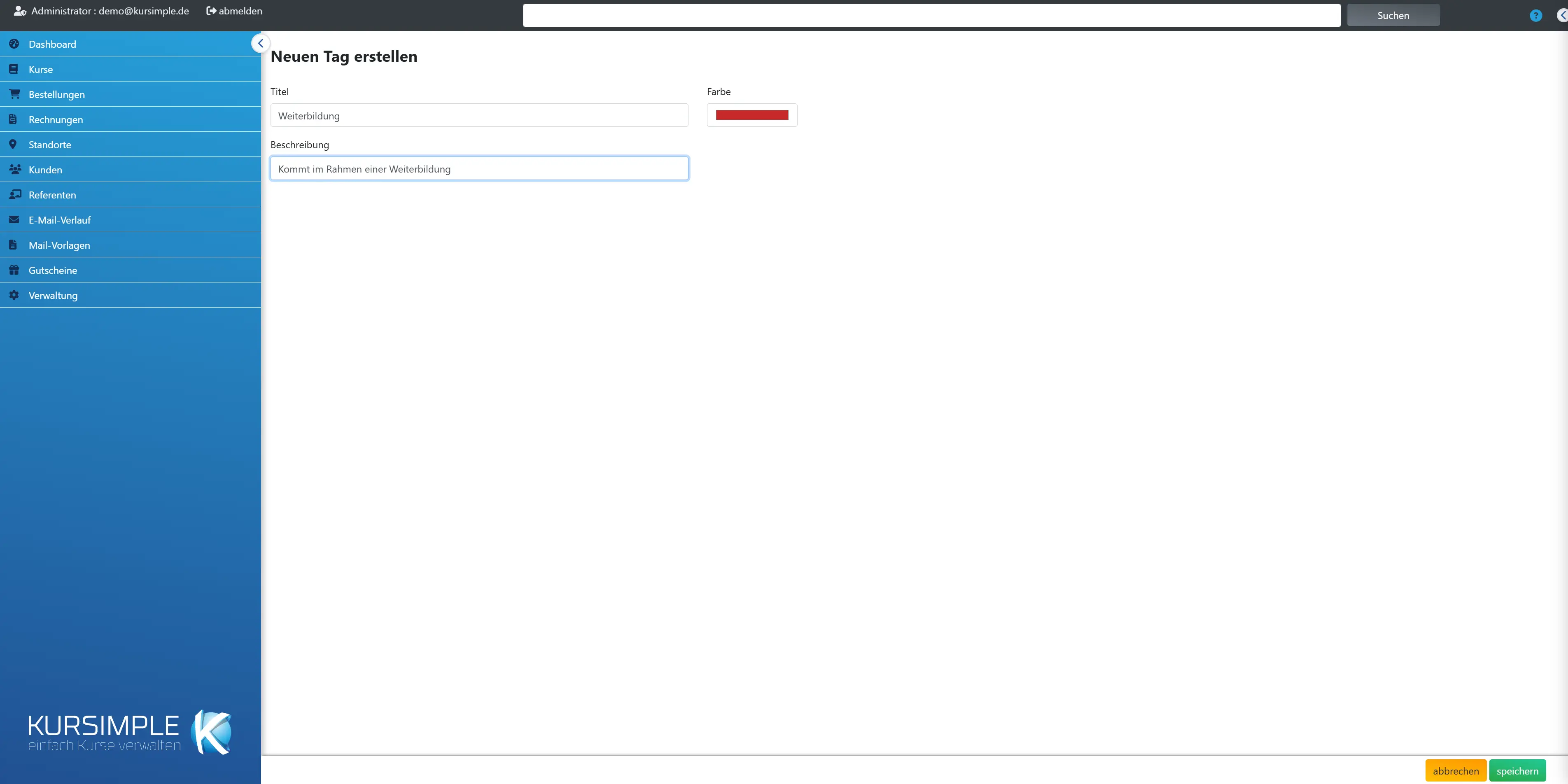
Title, description and colour of a tag. Changes apply immediately to all persons the tag is assigned to.
You change assignments in the respective record, not here.
Title
Required field. Short designation, e.g. “VIP” or “Newsletter”.
Appears as a tooltip and in the tag filter of the customer list.
Description
Explanation for other users: who gets this tag and why?
Optional, but helpful.
Colour
The colour of the square in the lists – set via the colour picker.
High-contrast colours are most recognisable.
save
Applies the tag – takes effect immediately.
Afterwards back to the list.
cancel
Back to the list without saving.
Entries are lost.
Absence reason
Absence reason
The details of a reason. Use “edit” to change it.
Display only.
ID
Internal number of the reason.
Relevant for internal use only.
Name
The designation as it appears in the attendance list.
Change via “edit”.
Active
Whether the reason is offered in the selection. Inactive ones are kept in old entries.
Toggle via “edit”.
Sorting
Order in the selection – smaller numbers first.
Change via “edit”.
Tag
Tag
The details of a tag. Use editing to change it; assign in the customer record.
Display only.
Tag
The designation – appears as a tooltip on the colour square.
Change via editing.
Description
What the tag stands for.
For orientation for colleagues.
Colour
The colour in the lists, as a colour code.
Change via editing.
Text block
Text block
The details of a text block. Use editing to change it.
Display only.
Position
The place in the portal where the text appears.
From the theme's position list.
Subject
Heading or internal designation of the block.
Visible depending on the position.
Message
The text with formatting, as it is output.
Change via editing.
Language
The portal language the block applies to.
One block per language.
Reasons for Leaving
Reasons for Leaving
Here you maintain the reasons why participants leave a course early, e.g. moving away, illness or “course doesn’t suit me”. They are available for selection in the leaving window on the “Attendance” page.
You enter a participant’s leaving on a course’s “Attendance” page, in the person’s row via “Leaving”: leaving date (the last course day) and reason. On later course days the person is no longer available for selection there. Booking, invoice and occupied places remain untouched – leaving is not a cancellation.
If there is at least one active reason, selecting one is required when leaving; without reasons you only enter the date.
In the statistics builder, for the row type “Participation” you choose the fields “Left”, “Leaving date” and “Reason for leaving” (group “Participant”) as a column or, in the analysis, as a group.
The function is switched on with the tenant variable AUSTRITTSDATUM = 1.
New reason for leaving
Enter a name and click “add” – the new reason is placed at the end of the list.
You change the order in the list with the arrows.
Order
Use the arrows to move a reason up or down – the reasons appear in the leaving window in this order.
In the statistics the reasons appear with their name.
Leavings
This many leavings carry this reason. A reason that is in use cannot be deleted – set it to “not active” instead.
An inactive reason is no longer available for selection; leavings already entered and the statistics keep it.
active
active
Only active reasons are available for selection in the leaving window. Leavings already entered keep their reason, even if it is no longer active.
Renaming also changes the name for all leavings already entered and in the statistics.
Rather see it than read about it?
In 30 minutes we will show you Kursimple with your own course programme. Or set up your own test system in 30 seconds – both free and without obligation.
Questions? +49 5931 990 99 10 · Mon–Thu 8:30–17:30, Fri 8:00–14:00 (CET)